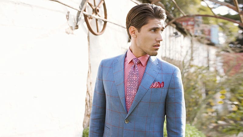
When it comes to donning prints this season, you heard it first from us: the bolder, the better. Bold prints may get a bad rap from skeptics who think of these patterns as gaudy and over the top. Yes, we won’t lie. Some bold prints should stay out of plain sight, but others can be worn most stylishly; why shouldn’t you brave a little more color? Below, we share our expert tips on how to wear bold prints to your advantage.
Check Prints
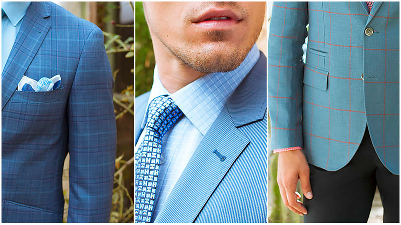
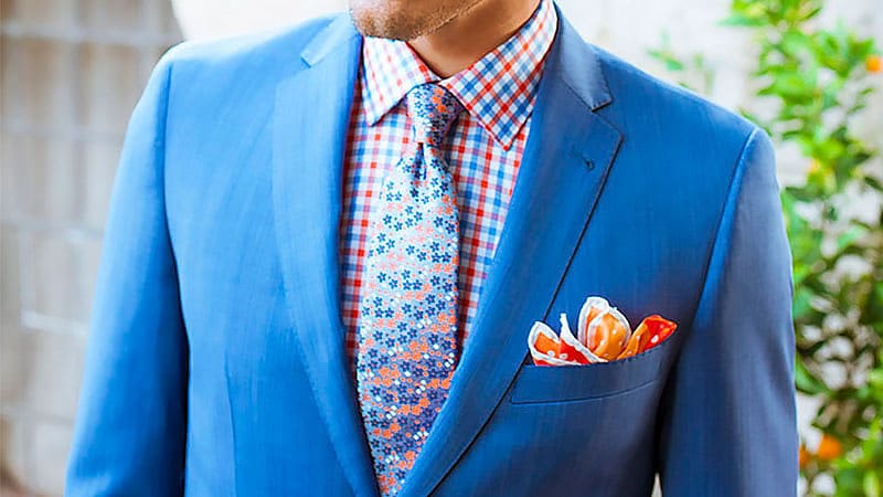
Keeping your checks in check isn’t too tricky, given the vast array of colors in which this bold print looks phenomenal. From the classic (solemn navies, black, deep charcoal, dove greys, and chocolate browns) to more daring color schemes (cherry reds, cobalt blues, grass greens, and popsicle oranges), there is always a way to do checks justice. Forget little touches; check prints are worthy of bold statements that will turn heads and leave a lasting impression. For chilly days, a check scarf is the only statement you will ever need alongside your favorite sweater/chino combination or weekday suit. Check shirts are also versatile; our top color choice is powder blue.
Stripe Prints
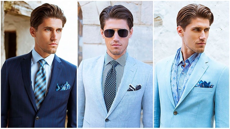
Be it nautical, skinny, or thicker versions; stripes are the perpetually stylish print that works for most dress codes. Who doesn’t love a striped tee, corporate striped tie, or preppy sweater? Stripes are certainly the prints that keep on giving, and investment in striped pieces should be more than welcome. Classic colors are the key to finding great striped pieces you can wear countlessly. This will allow you more versatility and make wearing a bold print something you will not regret.
Plant and Floral Prints
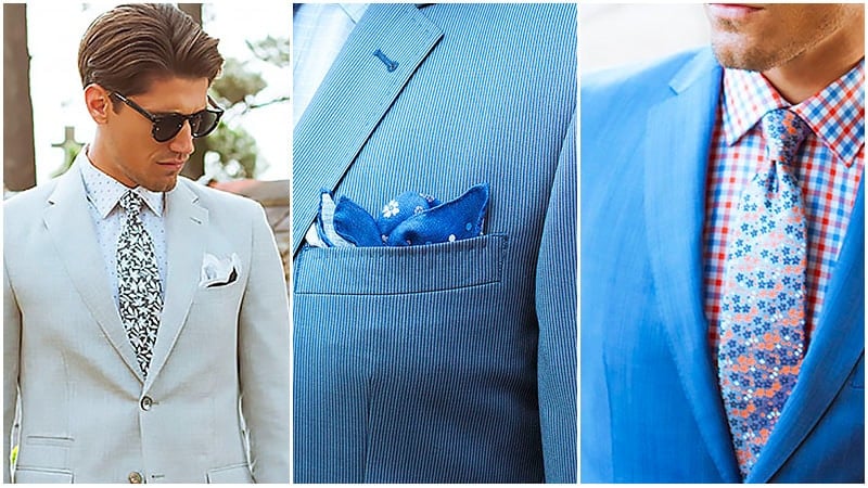
Keeping consistent with our recent street style trends, plant and floral prints are big news at the moment and are a fun take on bold prints. Get earthy with tree, flower, and plant-shaped prints that will bring the great outdoors to your sartorial choices. Keep a natural theme consistent with the colors you select for your prints with rusty taupe, earthy khaki, and treacle brown. This will ensure that your take on natural prints is more mature, lending an earthy aesthetic to a print typically done in brighter colors. Watch for novel pocket squares bearing floral symbols if you want a little incorporation of this trend.
Polka Dot Prints
Get spotty with some attractive polka-dot print apparel. While we advocated crazy bright prints for most of our other picks, polka dot prints should be more subtle colors for a refined aesthetic. Clean, simplistic-toned shirts in lavender blues, whites, beiges, and other natural tones are an unexpected take on this traditionalist print. They will ensure your outfits register mature rather than clownish. Pair your subdued polka dots with other prints and simplistic suits for a well-balanced aesthetic. Keep things dimensional with round sunglasses and subtle pocket squares.

Kaleidoscope Prints
For some serious psychedelic vibes, look no further than the bright, undisputable geometrics of kaleidoscope prints. Playful, intricate, fun kaleidoscope prints are glowing representations of beloved childhood toys. Regarding kaleidoscope prints, the brighter they are, the better. Kaleidoscope prints are best done when they pack a punch with vivid tones. What is the trick to pulling off crazy cool Kaleidoscope looks? Unlike stripes, it’s all about harnessing this print in smaller accessories. A kaleidoscope print pocket square is a great way to liven up a suit.

Gingham Prints
Gingham is the country-inspired print that has been most profoundly adopted into streetwear. Forever a trend, gingham is the print that will allow you a lot of versatility if you have a wardrobe full of classic, traditional hues and patterns. For weekend shirts, this print is best done in pastels, so remember when you are shopping for them to go for powder blues, dusty pinks, barely-there lemons, and avocado greens. This will help you look layered with your favorite slim chinos and suede loafers.
For dinners, gingham prints work excellently in all shades of blue, and more modern takes incorporate brighter shades like tangerine oranges and bright greens. While Gingham works marvelously when done right, done wrong, and it reads outdated and messy. The key to pulling it off is to opt for fitted shirts that cut a more youthful silhouette. If you are after ties, you can afford to go a little bolder with your color choices but still preserve an essentially classic look.

Roger Grinstead is a senior apparel designer for X2U with over 25 years of expertise in the fashion industry. He has expertise in menswear and womenswear trends and product development. When Roger is not designing the latest fashion garments, he enjoys writing about men's fashion, hairstyles, and grooming.
SUBSCRIBE TO OUR NEWSLETTER
Subscribe to our mailing list and get interesting stuff and updates to your email inbox.